We have rebuilt the Socialhose interface from the ground up. It is live in your account right now, and the first thing you should notice is that it gets out of your way faster.
The short version: the app is quicker to load, denser to read, available in six languages, and usable on a phone. Your navigation and your controls have not moved. Here is what changed and why.
It is faster, and that was the whole point #
The old interface made your browser download roughly 820 KB of compressed JavaScript before it would show you anything, on every single page. That is a lot of waiting for an app whose job is to tell you what people are saying about you right now.
That number is now around 300 KB. The code that runs before the first screen appears dropped by about three quarters. Charts, rich text editors, PDF tooling, and network graphs are heavy, and most of the time you are not looking at any of them, so they no longer load until you open a page that actually uses one.
In practice: dashboards, the Mentions feed, and Live Searches paint sooner, moving between tabs no longer feels like a page reload, and the app starts up quickly on a mediocre connection instead of hanging on a blank screen.
We also found a genuinely embarrassing bug while we were in there. Every user was downloading all six of our language translations, in full, just to read the app in one language. Now you download the one you use.
A new look: compact and built to be scanned #
 Socialhose is a monitoring tool. You come to it to read a lot of information quickly and decide whether something needs your attention. The old design spent a lot of screen space on padding, rounded cards, and soft shadows that looked pleasant and told you nothing.
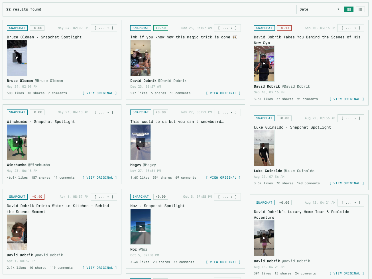
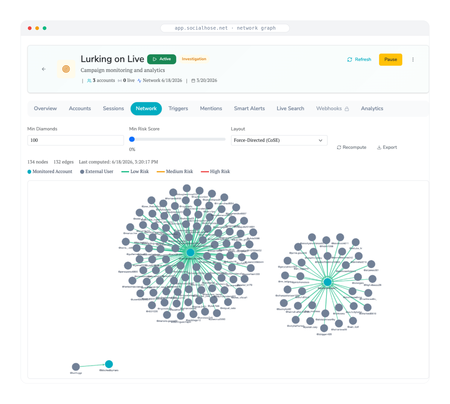
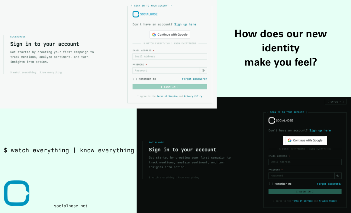
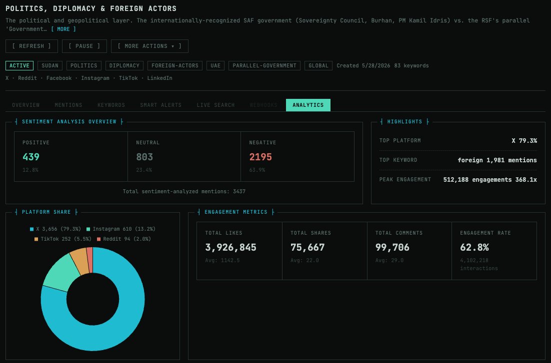
The new design is a terminal-inspired system: monospaced type, sharp corners, thin panel borders, and dense rows. Concretely, that means:
More on screen. Tables, feeds, and dashboards fit substantially more data in the same window, so you scroll less.
Numbers that line up. Monospaced digits mean columns of counts, percentages, and timestamps align vertically and can be compared at a glance.
Colors that mean something. Status color is now semantic and consistent everywhere: green is healthy, amber is degraded, red needs you. Nothing is colored just for decoration.
Dark and light themes. Both are first-class, and you can switch at any time from the toggle in the top bar. Your choice is remembered and applied before the page paints, so there is no white flash.
Honest loading states. Pages that are still loading now show the shape of the content that is coming, instead of a spinner that tells you nothing.
Nothing moved #
This is a new coat of paint on the same floor plan. Your navigation, your Live Searches, your Mentions, your campaigns, your alerts, your reports, and every control you rely on are exactly where you left them, and they work the way they always have.
The visual change is dramatic. The muscle memory change is close to zero. That was deliberate: we did not want to hand you a faster tool and then charge you a week of relearning for it.
Six languages, done properly #
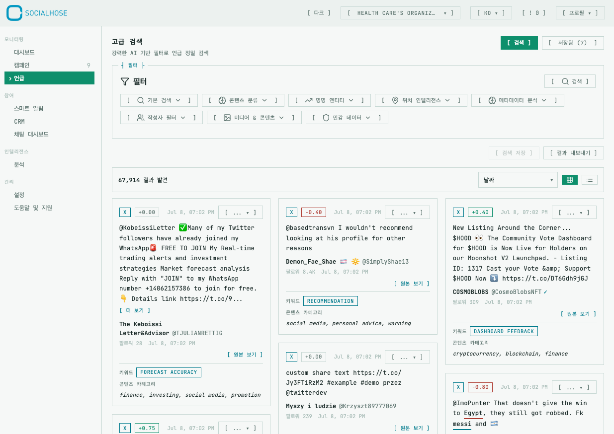 Socialhose is now fully translated into English, Spanish, French, Portuguese, Korean, and Arabic. Not partially, not the menus only. Every screen, every button, every empty state, every error message.
Arabic includes full right-to-left layout, so the interface mirrors properly rather than just swapping the words around inside a left-to-right skeleton. Set your language from the top bar and the whole app follows.
It works on your phone now #
The old interface technically rendered on a phone in the sense that pixels appeared. The navigation menu was, in practice, unreachable on a narrow screen. That is fixed. The app now collapses cleanly down to phone width, so checking a campaign between meetings is something you can actually do.
On the desktop, the left navigation rail can now be collapsed when you want the full width for a wide table.
Under the hood, briefly #
For the curious: this was not a reskin. We removed the entire old component framework and rebuilt the interface on a single design system with a shared component library. Around 465 files changed and roughly 53,000 lines of code came out of the codebase on net.
That matters to you for one reason. Every panel, table, badge, and form control in the app is now one shared component instead of dozens of near-copies. When we improve one, it improves everywhere at once, and new features arrive faster and more consistently than they used to.
But how does it make you feel? #
When we are doing media intelligence work, we want to feel like we're doing something cool and interesting. We want to feel like this system understands how to turn data into intelligence from just a quick glance at it.
We built this because we use Socialhose too. We designed things this way because we use it all the time. If something looks wrong, or you miss something from the old interface, we want to hear about it. Get in touch with our support team and it lands in front of the people who built this.
Open the Socialhose Platform and have a look. Let us know how it makes you feel.